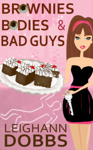
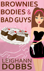
I have two covers for my latest book Brownies, Bodies and Bad Guys and I can’t decide which I like best!
Which one do you prefer?
| COVER 1 | COVER 2 |
 |
 |
I have two covers for my latest book Brownies, Bodies and Bad Guys and I can’t decide which I like best!
Which one do you prefer?
| COVER 1 | COVER 2 |
 |
 |
I like the first cover, but the second c
Yipes! Accidentally sent without finishing! I was going to type that the cover without bullet holes seems more in keeping with the previous books’ covers. Either way, I’m looking forward to reading the latest Lexi Baker book! 🙂
Well, I think the one with the bullet holes is pretty cool! If the victim got shot (I haven’t read the synopsis yet)… But I’m assuming he was, so yea… the one with the bullet holes! 😀
I prefer cover #2
Cover 2 is nice and clean looking. However, Cover 1 draws your eyes to the front cover.
Definitely the Bullet Holes Lee!
I really like cover 1, but I think cover 2 is better – it goes more with the cozy nature of your books.
Cover 1
Cover #1
I don’t know, but I think I like the first cover slightly better… 🙂
Hm, are those bullet holes? The black stands out, but I had to look closely to see what they were, and even then I wasn’t sure. Personally I like the second one best, even though the black does draw the eye – it just doesn’t add anything of interest to me.
Yes, they’re bullet holes. I think they are cool, but in the thumbnail of the cover, I’m not sure anyone can tell they are bullet holes.
Cover #1……of course
Cover #2, I just feel that fits better with the genre of the books.
I’m voting for cover #2. The bullet holes would work for a physical book. But for Kindle, with as small as the thumbnails can get, they just become a distraction.
I was hoping the little bullet hole things were brownies. I’m hungry.
LOL!